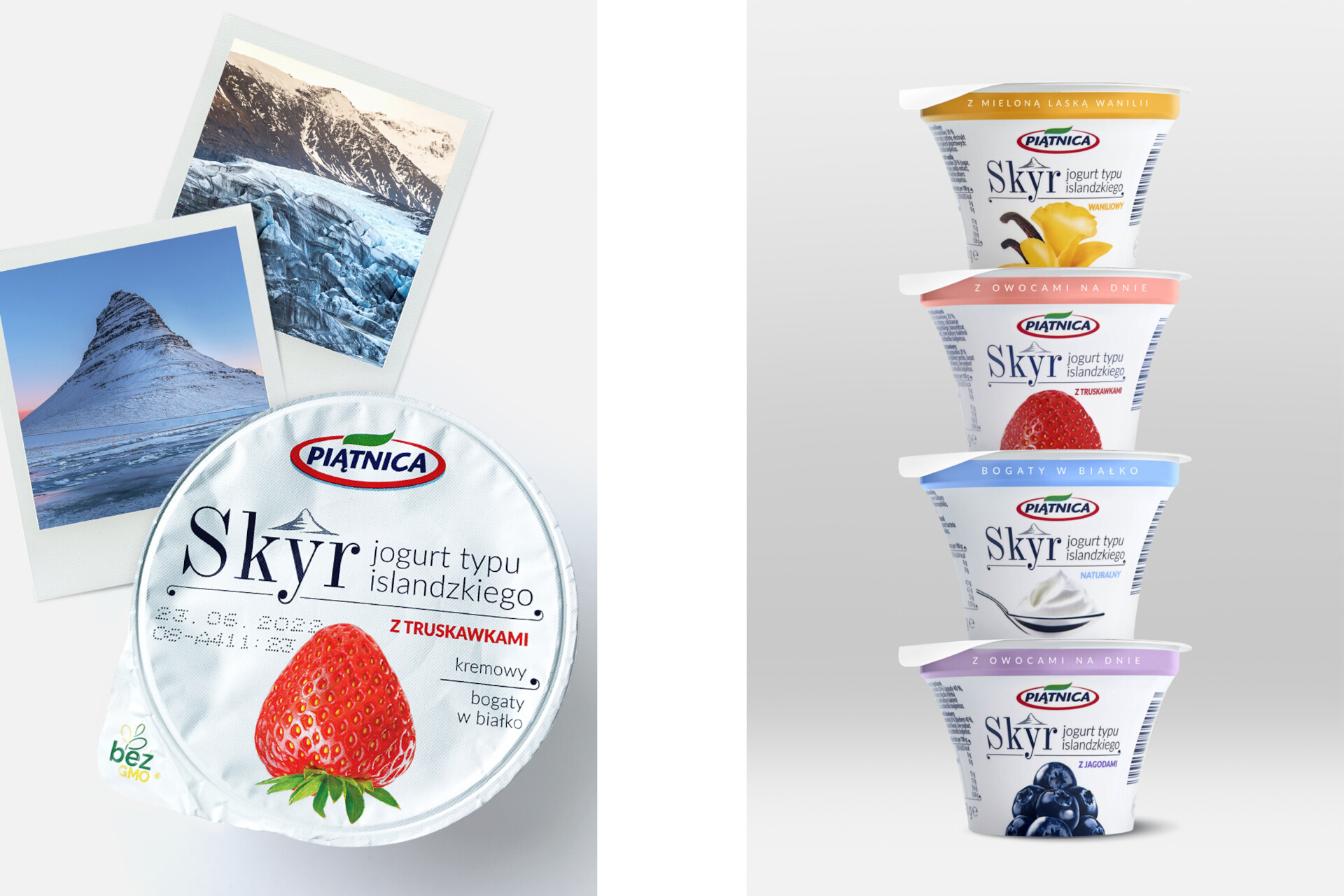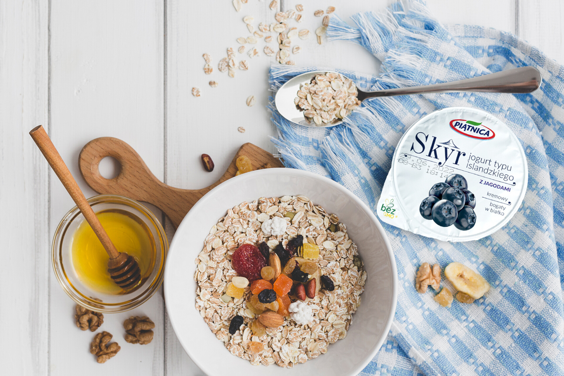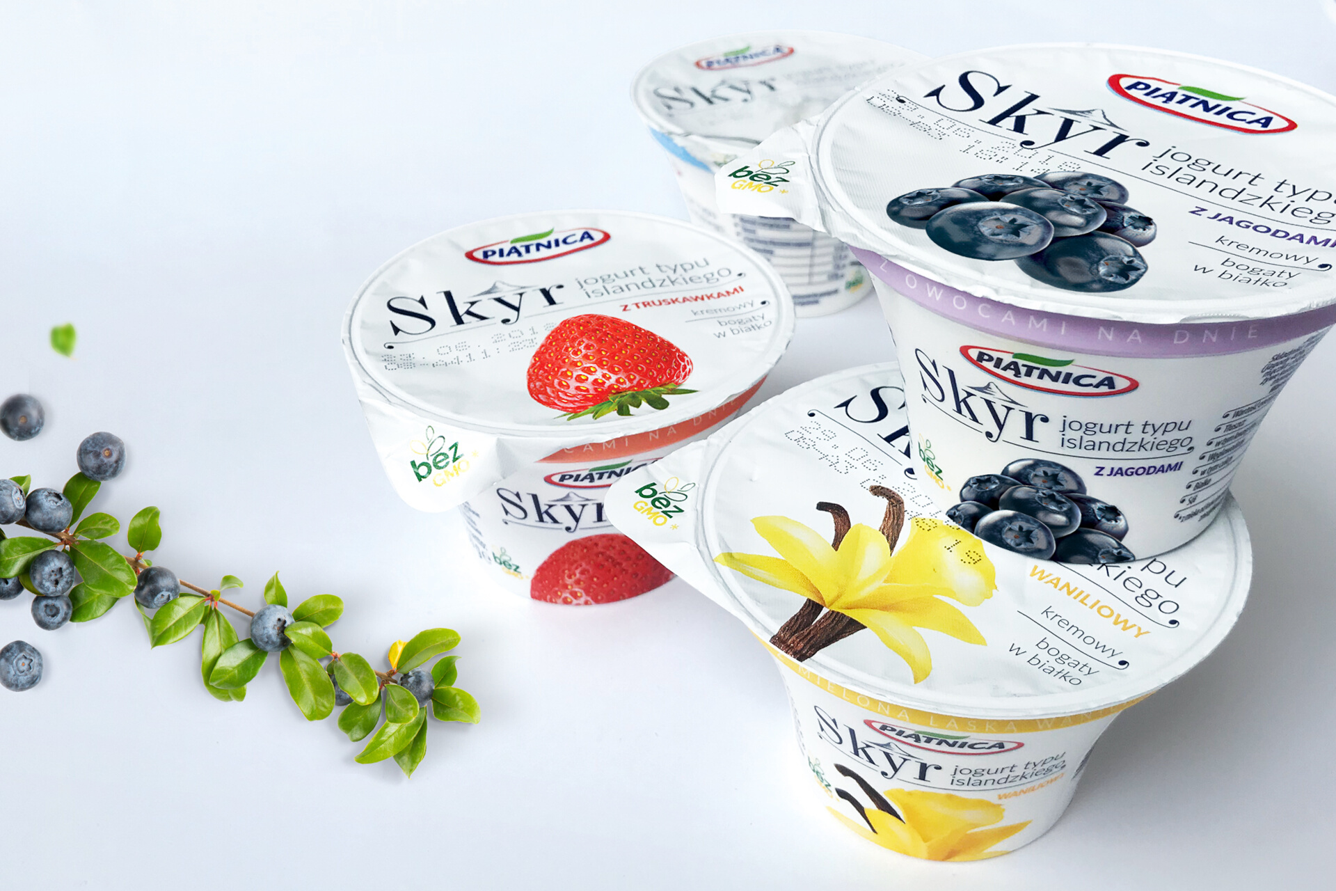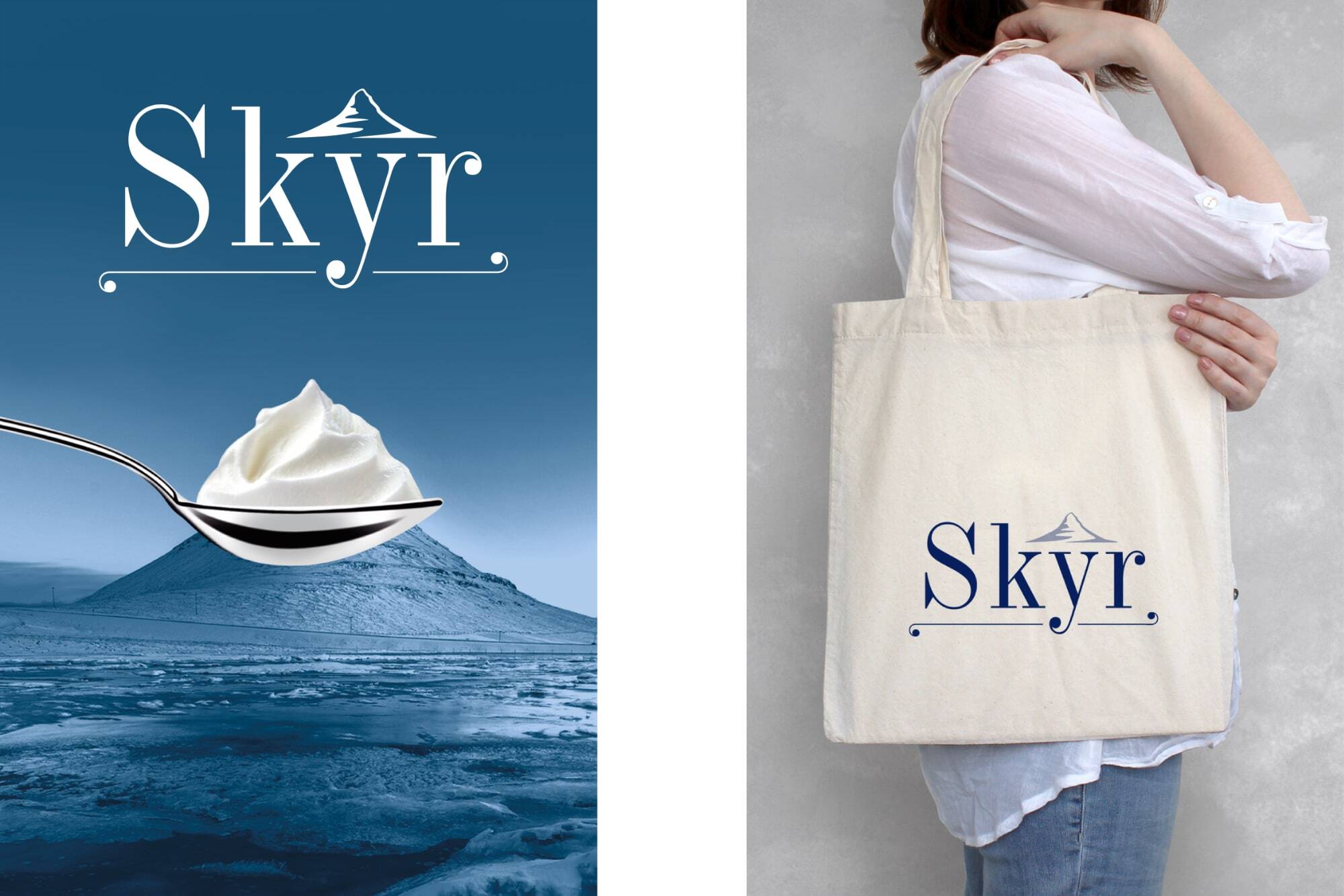
For the Piątnica Dairy Cooperative, we developed and implemented a comprehensive branding strategy for their new Skyr brand and designed packaging for Skyr yogurt lines.
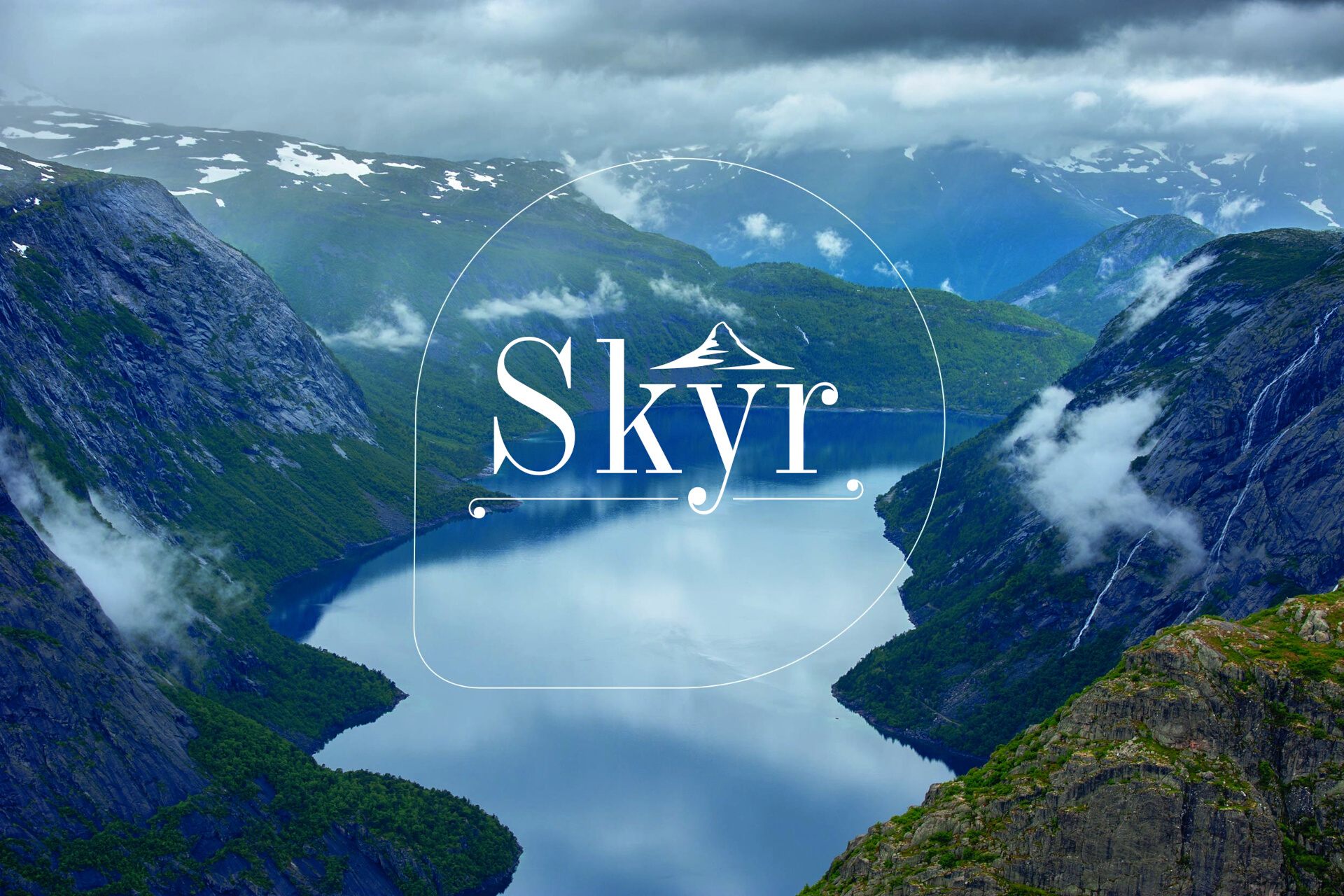
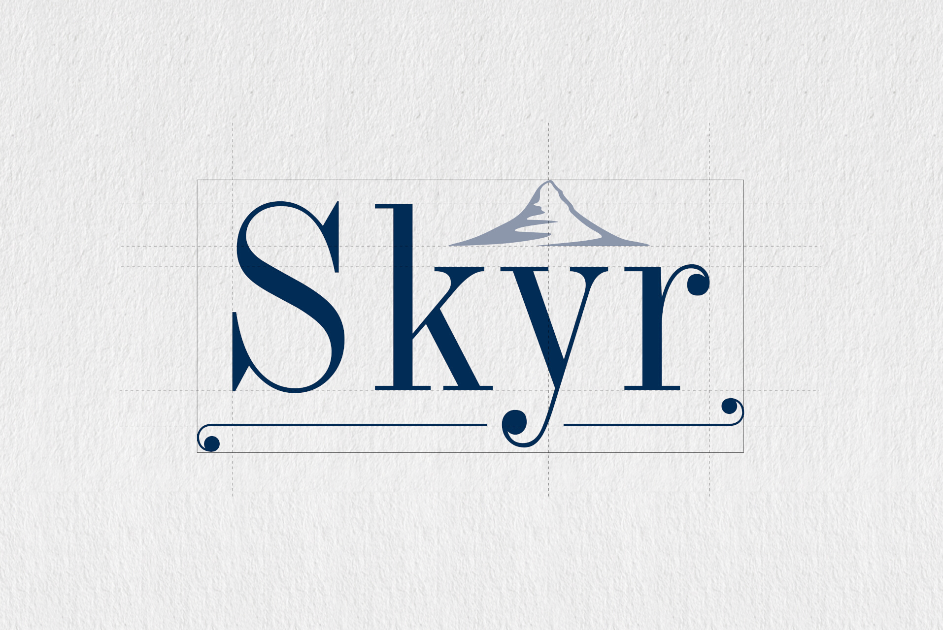
Skyr is a traditional Icelandic yogurt that has been made for centuries. Our creative concept was based on one of Iceland's symbols – Mount Kirkjufell. This beautiful peak on the Snæfellsnes Peninsula became a distinctive element of the logo. Its original shape inspired us to create cone-shaped compositions with fruits and yogurt, which we placed on the packaging design. We used the Industrial 736 EU font to write the name Skyr. Its sharp lines of varying thickness refer to the Icelandic landscape, where cracked ice covers black volcanic rocks. To enhance the impact, we used a dark, deep shade of navy blue in the graphic design of the logo and contrasted it a the white background. The round letter endings and horizontal underlines refer to traditional Icelandic ornamentation.


