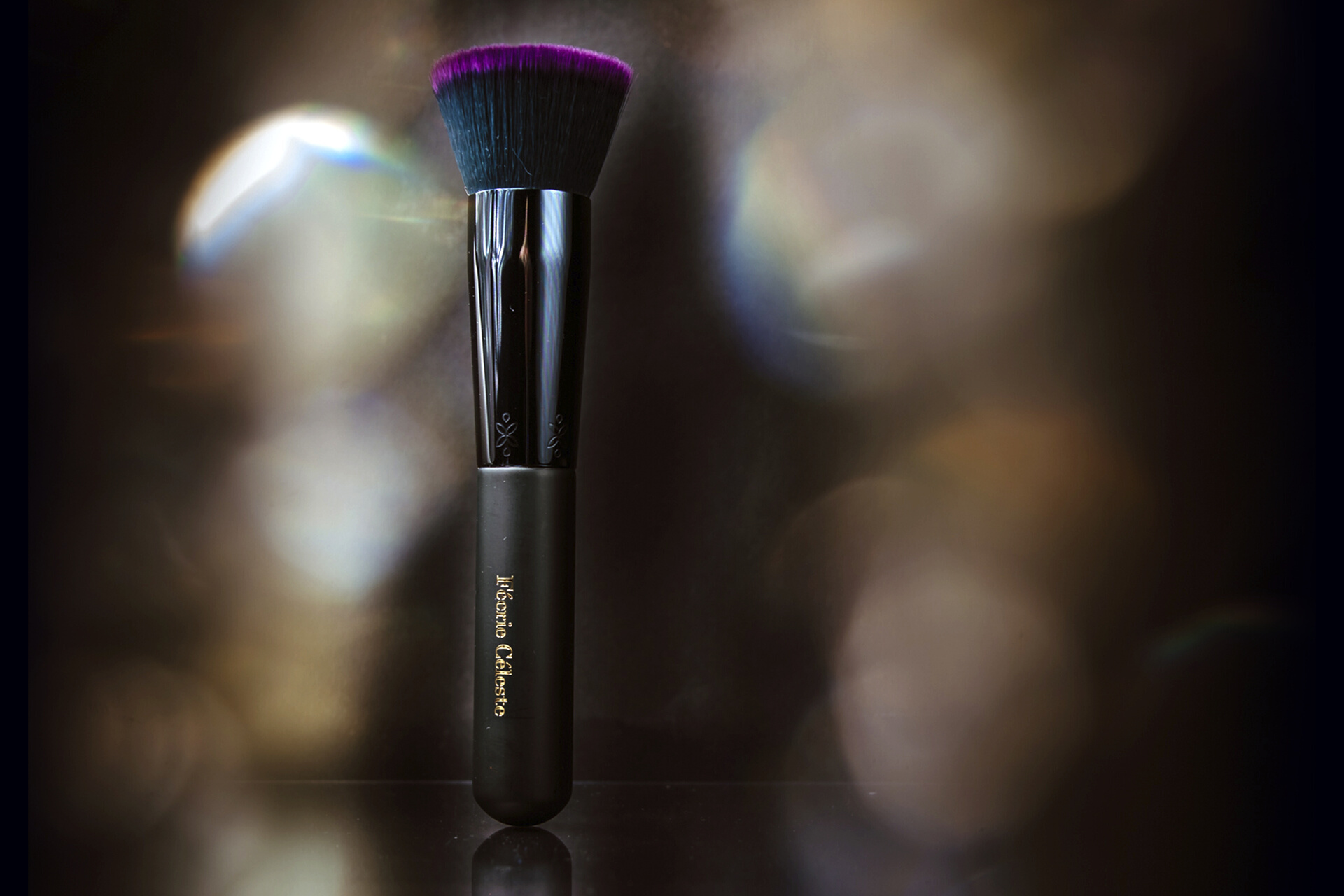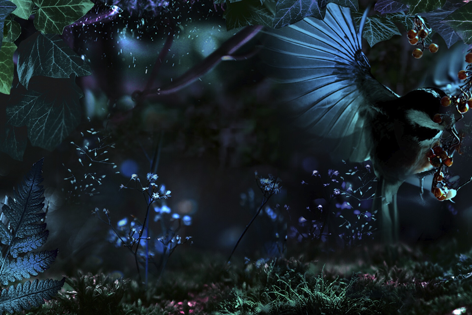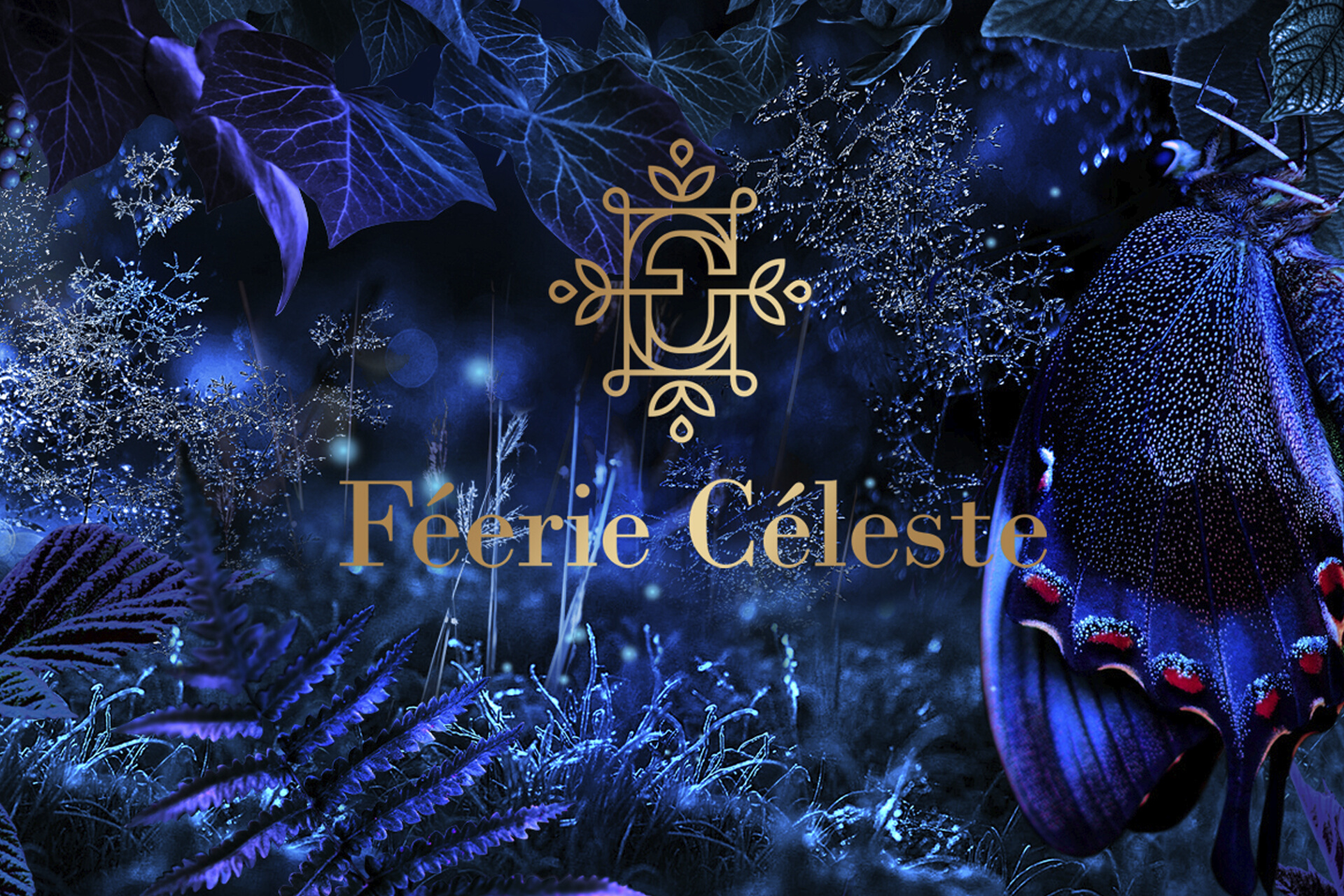
Féerie Céleste is a brand of natural cosmetics that reminds us that miracles happen all around us. We see them in dewdrops, hear them in the flutter of bird wings, we feel them in the scent of moss… Let us take you on a journey to a magical garden of night, mystery, and feminine beauty.
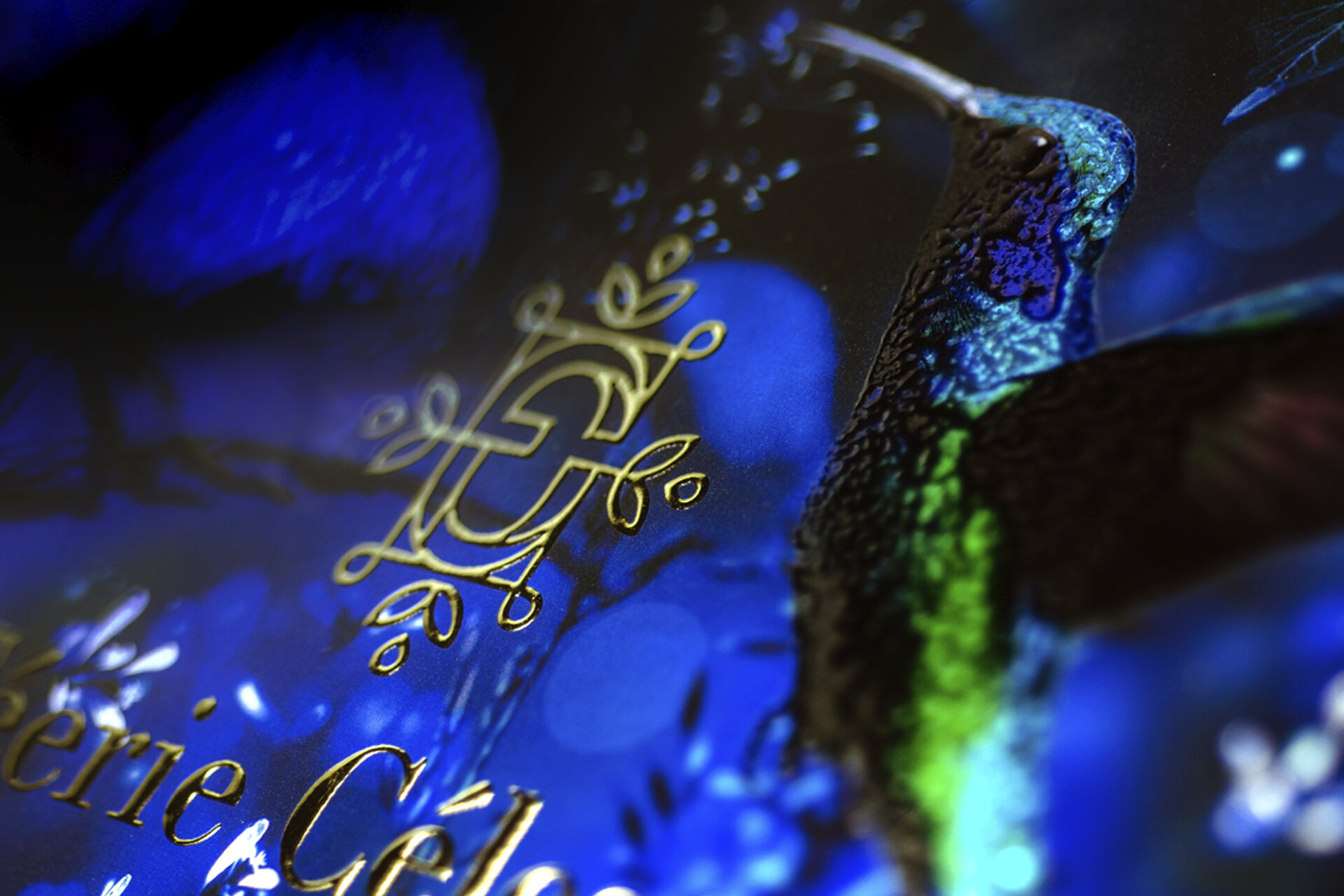
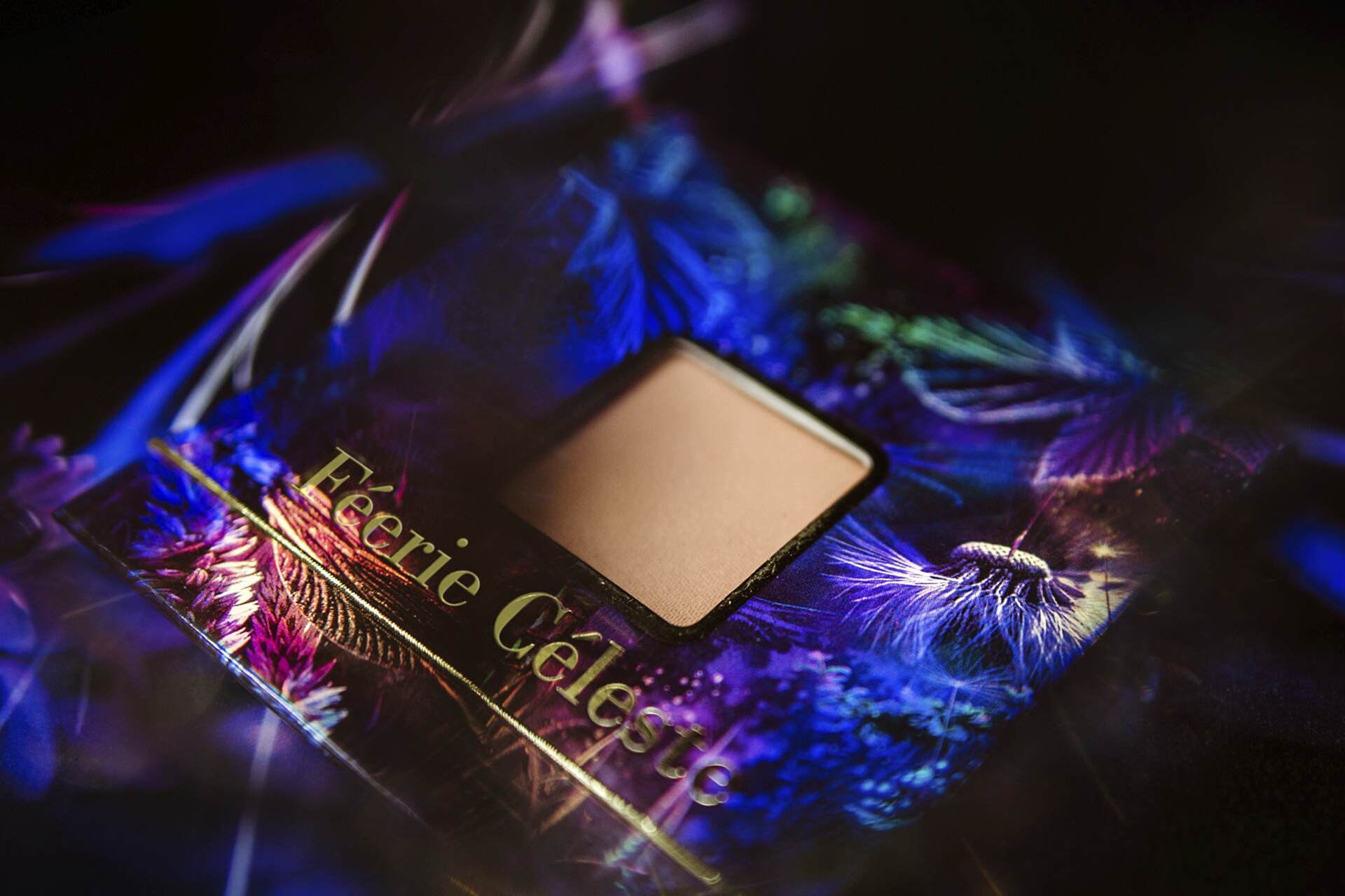
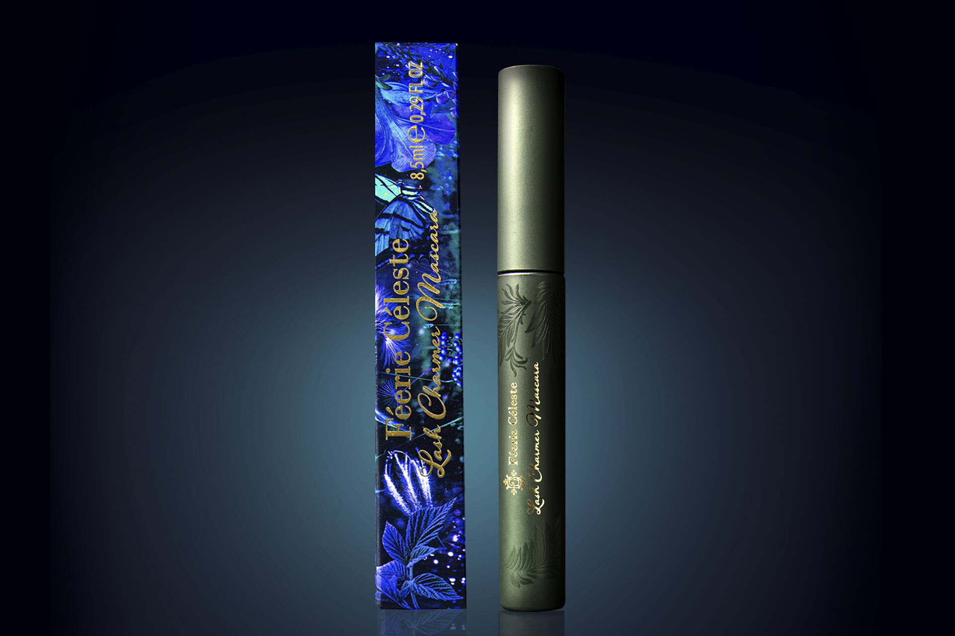
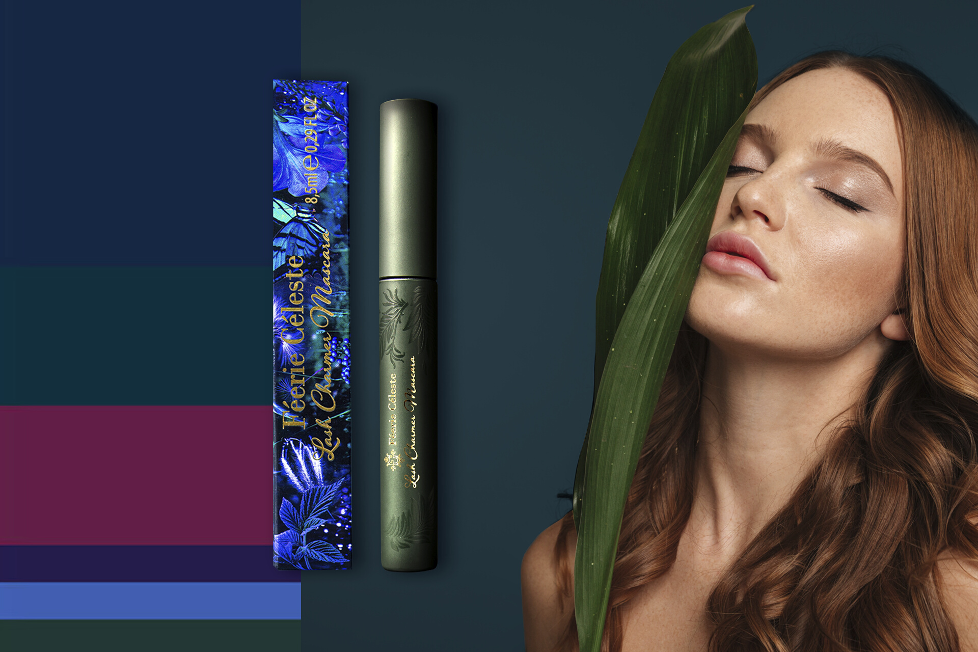
We present to you a unique project – a brand that we had the opportunity to create from scratch. Storytelling, graphic design and the entire world of Féerie Céleste is a story of beauty and magic. The richness of nature and the beauty of the enchanted world were our inspiration. In the garden we see ferns, grass, moss, ivy… In these small elements, we find a mysterious atmosphere that is the heart of the brand. The motif of the black fairy reoccurs in everything, in a way invisible to the customer. It is a metaphysical character, and its attributes are: intricately woven lace, botanical patterns, flowers, butterflies, moths, dragonflies and birds. The world of nature is a strong motif in the visual identity of Féerie Céleste. In terms of colours, we opted for darker shades, primarily navy blue and green, interspersed with a subdued pink hue. According to the concept, the colours were meant to be cool, perfectly fitting the atmosphere of a garden at night.
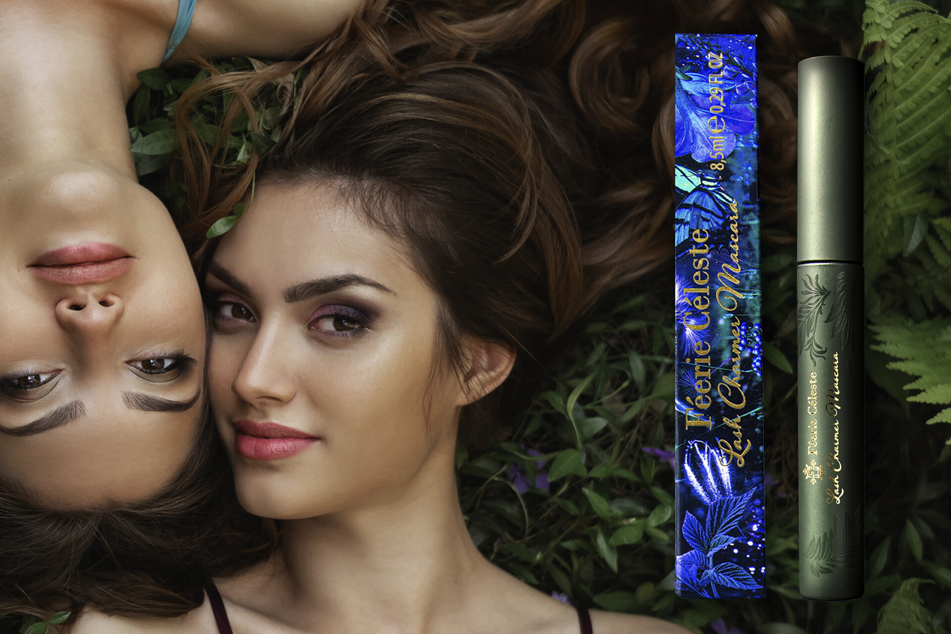
The small packaging of our project delights with elegance and attention to detail. The labels were printed in Italy, using a special holographic glossy foil. This technique gives each product its own personality. The brand's secret and emotional character makes you want to discover the entire line of its products. And that's exactly the effect we aimed for. So close your eyes, listen to the rustling of grass, the owl flying overhead, the stream flowing in the background, and see the fireflies lighting the way…


