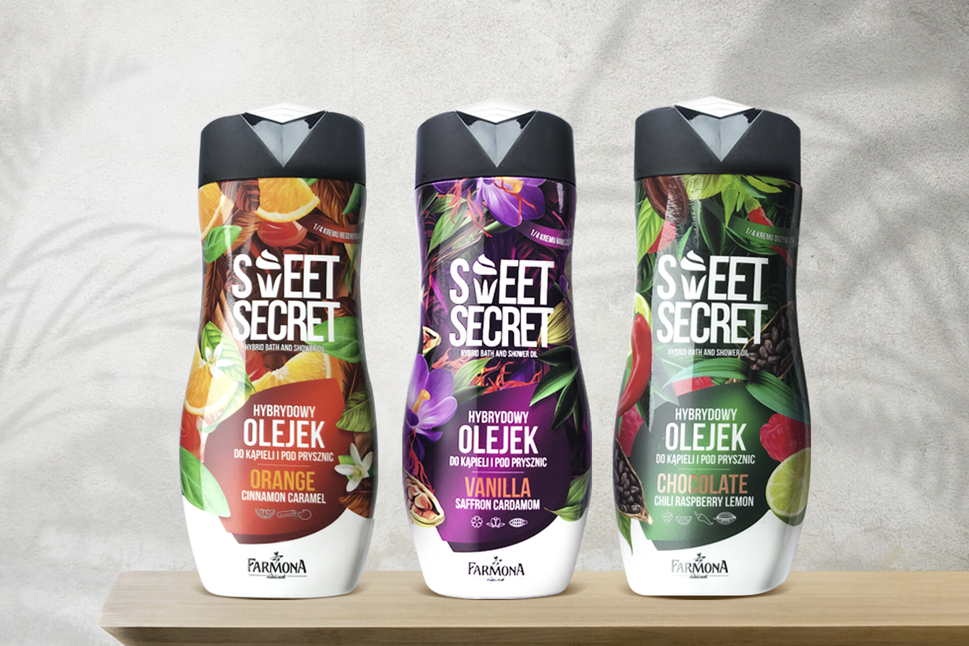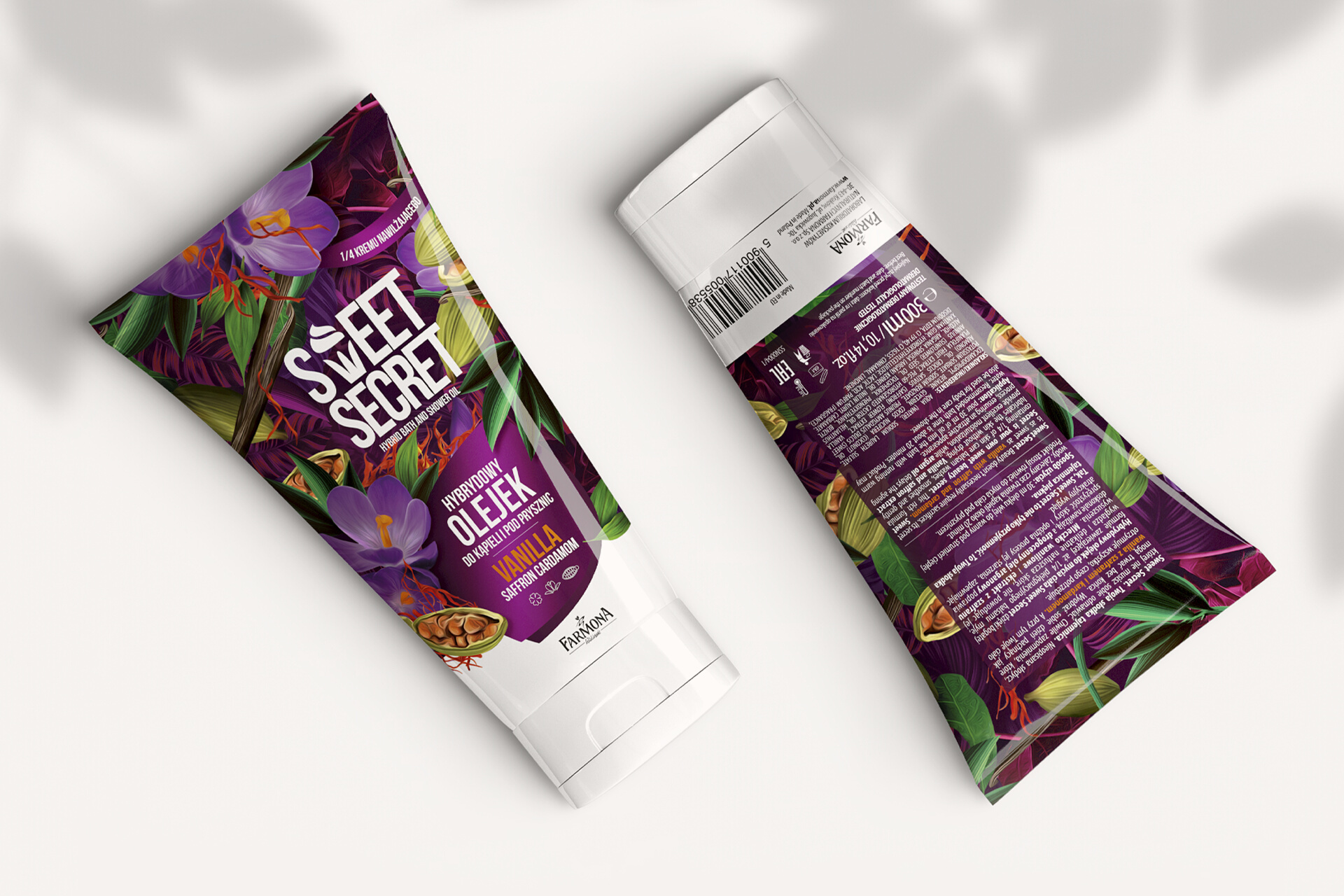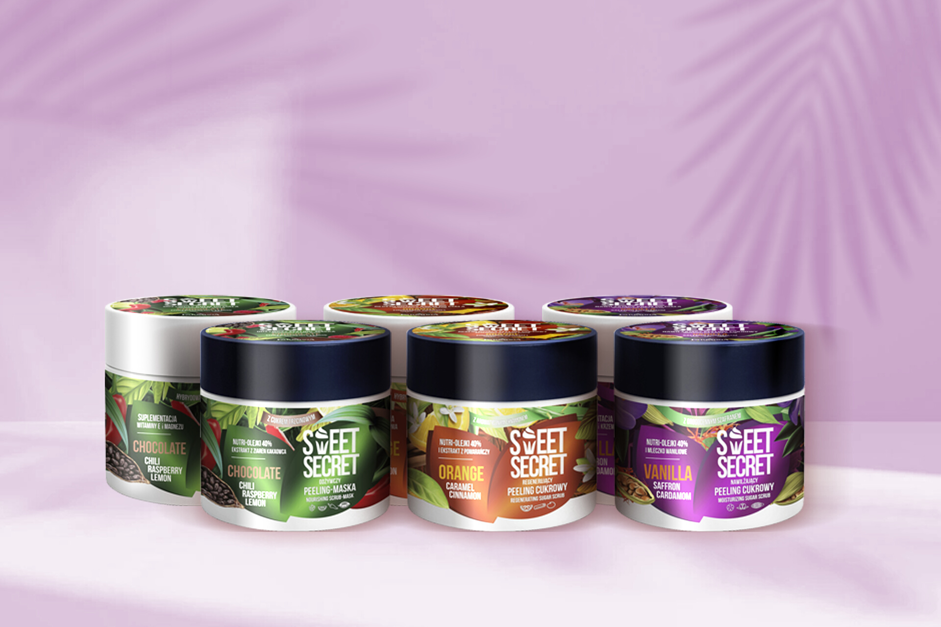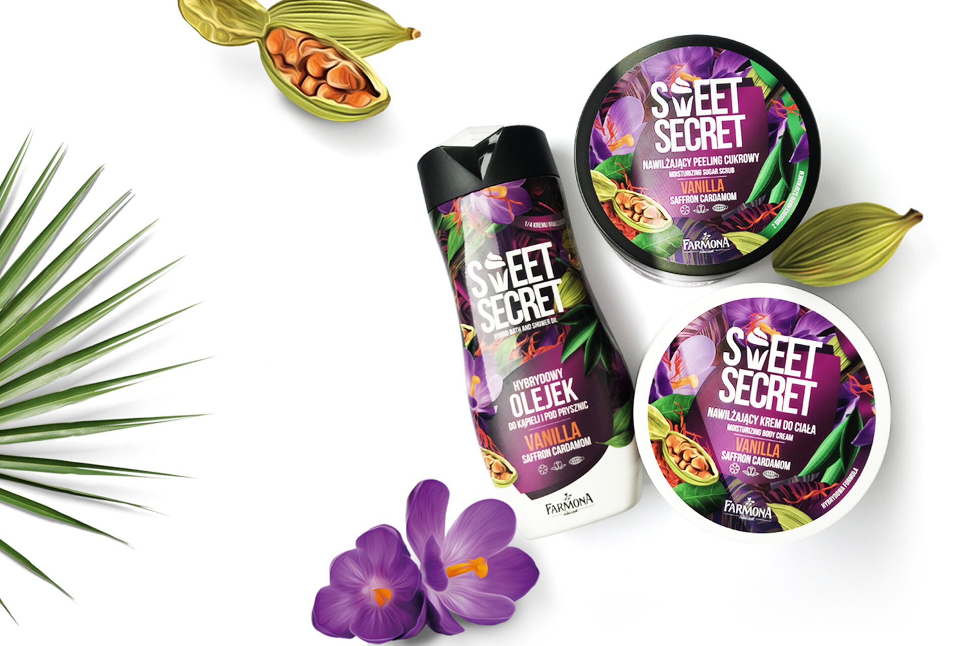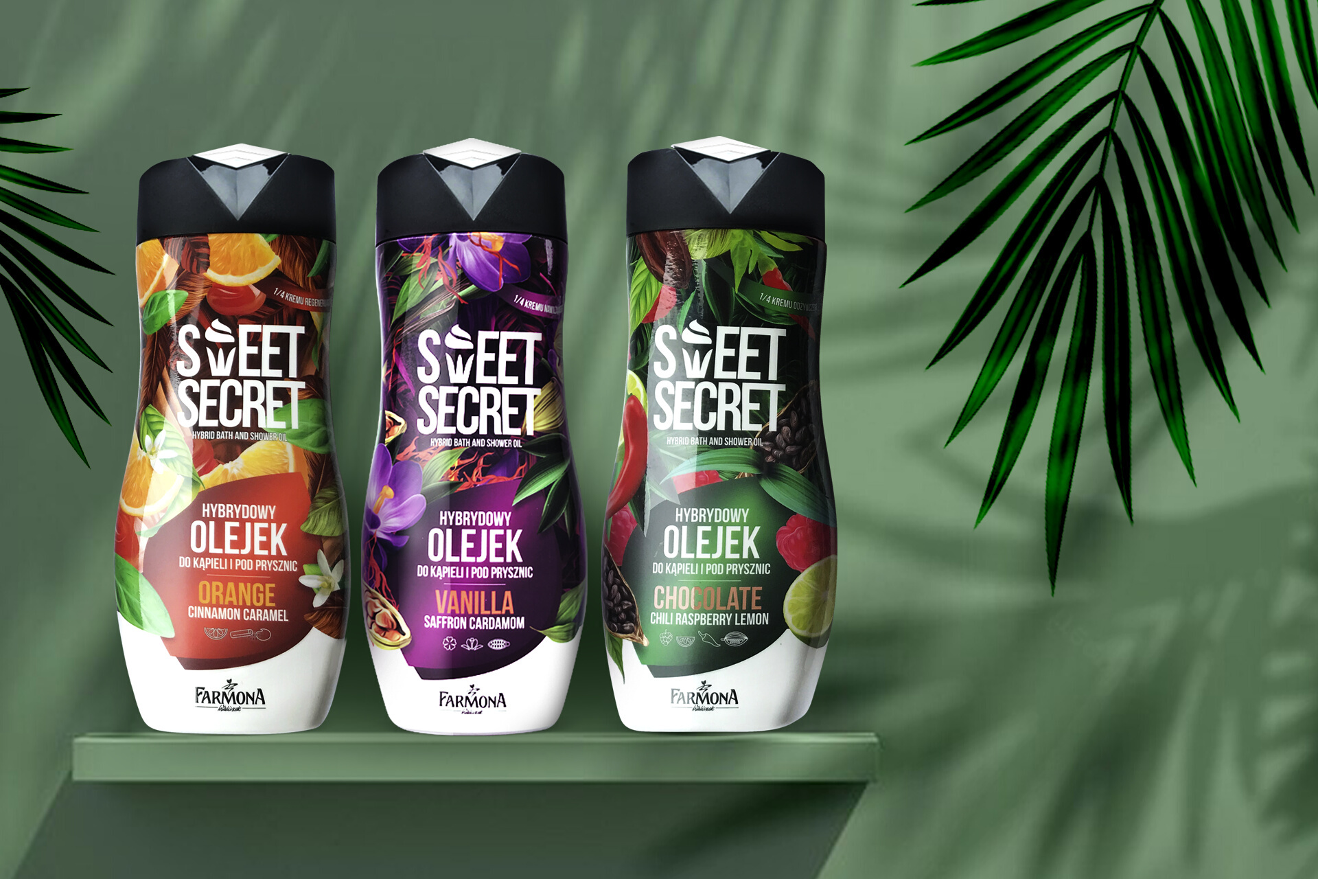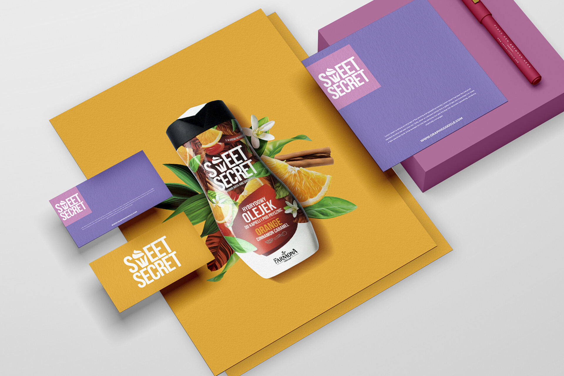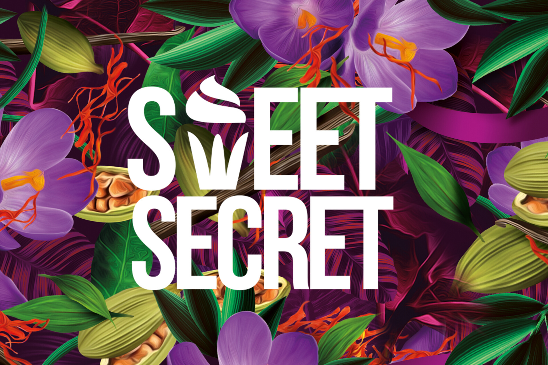
For the popular cosmetic brand Farmona, we carried out branding activities and created the graphic design of packaging for the exceptionally appetizing Sweet Secret line - products for body washing and care. First, we created a distinctive logo featuring a muffin symbolizing sweetness incorporated into the letter "W". To emphasize the sensual nature of cosmetics, their positive impact on mood and seductive fragrance, bold, juicy colours were used. We reached for a modern and easy to read typography, and the name of the entire line was written in a simple, sans-serif font in white. The result was a unique packaging design that naturally fits into the brand's strategy. Eye-catching compositions in the spirit of maximalism - large flowers and fruits stylized realistically, create a dense, exotic structure. The colourful packaging communicates the natural character of the ingredients and promises extraordinary sensory experiences. Each product in the line differs in colour.
