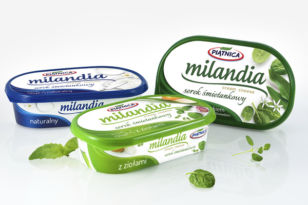
We designed a line of premium cream cheese products for OSM Piątnica. In order to distinguish their unique flavours, we decided to go with a distinctive branding. Layout communication is built around the Milandia logo. The logotype, the wave-shaped panel and lid frame change colour depending on the cheese flavour. The intense colours of the elements of the composition placed on a white background give the impression of freshness and create an impactful presence on the shelf. The layout is structured and clear, and the simple typography further enhances its readability. Realistic, casual compositions of appetizing ingredients captured from above attract attention and emphasize the product's natural character.


